


A few weeks ago, I did a jokey little tweet about the fact that “All-American Bitch,” the first track on Olivia Rodrigo’s new album, Guts, is a much better version of the big speech that America Ferrera delivers in Greta Gerwig’s Barbie. There’s a contingent of smart online women who have been talking about how much they hated Barbie, and I’m not one of them. I actually liked it a lot! But I did find that speech frustrating.
If you haven’t seen Barbie — I guess I’m about to do spoilers? If that’s a problem for you, just keep scrolling until you see some interesting paintings.
Scroll! Scroll away!
For those haven’t seen Barbie and don’t mind spoilers: The speech I’m talking about is a treatise on the contradictory demands that society places on women, who are doomed to fail no matter how hard they try to live up to these standards. At this point in the movie, Barbie (Margot Robbie) and Ken (Ryan Gosling) have traveled from Barbie Land (where the Barbies are in charge) to the real world (where white men are), and the newly empowered Ken has returned to Barbie Land with some ideas about how to shake things up. By the time Barbie catches up with him, Barbie Land has been overrun by patriarchy.
Barbie feels utterly defeated, and the situation seems unsalvageable. This is when Gloria (America Ferrera), a Mattel employee who Barbie met in the real world, explains the shit pretzel that is modern womanhood. Here’s a small portion of her speech:
You have to be thin, but not too thin, and you can never say you want to be thin. You have to say you want to be healthy, but also you have to be thin. You have to have money, but you can't ask for money because that's crass. You have to be a boss, but you can't be mean. You have to lead, but you can't squash other people's ideas. You're supposed to love being a mother, but don't talk about your kids all the damn time. You have to be a career woman but also always be looking out for other people.
Critiquing this monologue makes me feel like a jerk. What Gloria is describing is real, but it’s also, at least in my world, pretty well-established. That doesn’t mean these ideas aren’t worth talking about or exploring through art. They are. But using what Allison P. Davis correctly describes as “feminism baby food” as the basis of Barbie’s thunderbolt moment feels placating and a little insulting. We deserve a better thunderbolt!
To make matters worse, Gloria’s speech works, inspiring the Barbies to regain control of Barbie Land — which, it turns out, isn’t even that hard. (The Kens are not smart.) Progress in Barbie Land doesn’t translate to progress in real life, though, neither in our world nor in Gloria’s. Everything she says is true, but in the context of Barbie, it feels like false empowerment, baby food with a synthetic taste.
What’s funny is that “All-American Bitch” makes the same point as Gloria’s speech, but in a way that totally works for me. This is what I love about language and art: A bunch of people can chase the same idea, but with the right framing and word choice, one of them will make you feel it in a way that the others don’t. And I feel this song!
Like the Barbie speech, “All-American Bitch” is about the double standards that entangle women. Rodrigo’s lyrics are written from the perspective of someone who has managed to attain some societal vision of feminine perfection, but they’re loaded with sarcasm (“I make light of the darkness / I’ve got sun in my motherfuckin’ pocket”); the song swings violently between the sweetness of the fantasy Rodrigo is invoking and the rage and disillusionment that she actually feels. Maybe “All-American Bitch” works for me simply because it’s super catchy. Or maybe it’s because, as my friend Danny put it, “Olivia is just raw expression” — she’s getting something off her chest, not moving the plot of a film towards an unearned conclusion of female empowerment.
And like I said, her word choice really works for me. Let’s turn to the outro:
All the time
I’m grateful all the fucking time
I’m sexy, and I’m kind
I’m pretty when I cry
“I’m sexy, and I’m kind” — I picture it sung by a choir of angels who look like Instagram models — is a funny, brilliant line. It probably means something different to Rodrigo than it does to most people: She’s a 20-year-old pop star who is expected to be physically appealing, nice to her fans, and grateful for her success. But the ideal that she’s describing also applies to ordinary citizens. Can you imagine what it would be like to be that hot and pure of heart? And what if it was your greatest joy to be so easygoing and pretty? What a gift life would be! What a gift you would be! You would be… Barbie.
I’m sure there are people who will listen to “All-American Bitch” and find it as facile as I found the Barbie speech. That’s fine, but even they must admit that it’s a banger.
An interview with Meghann Stephenson, artist
During college, I interned at the jewelry brand Pamela Love. At the time, it was a fashion industry darling known for bracelets shaped like pentagrams and bird talons, arrowhead necklaces, and rings studded with spiky bouquets of crystals. Whatever witchy-lite aesthetic I cultivated in college was heavily informed by this brand.
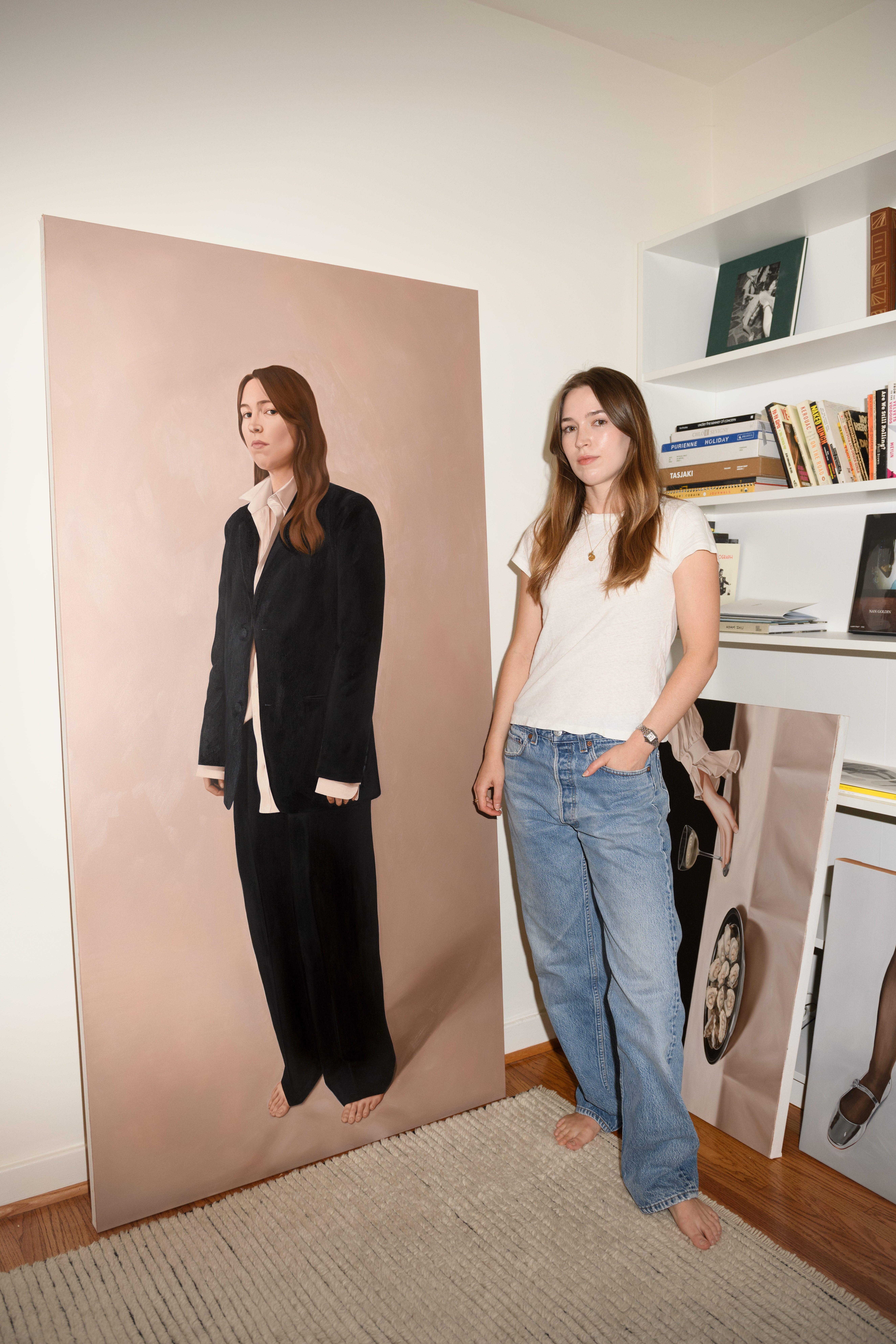
One of my fellow interns was a Parsons illustration major named Meghann Stephenson, who I always thought was incredibly cool and talented. Today, Meghann is a freelance illustrator based in LA. I’ve followed her work for years, so I was intrigued when, sometime in the last year, she started posting heavy-duty oil paintings in addition to the watercolors that often appear on her Instagram.
Meghann’s oil paintings are undeniably “girl coded,” full of flowers, ribbons, ruffled sleeves, and cake frosting. They’re beautiful, but what really keeps me coming back is their sense of stillness and restraint. This is a feminine world that’s private and a little somber, rendered in muted colors against a velvety black void. The paintings hold you, perhaps uncomfortably, at arm’s distance.
Because I’m nosy and wanted to know more about Meghann’s recent output, I asked if I could interview her for this newsletter. Because she’s lovely, she agreed. The following has been edited and condensed.
Eliza: I remember my time at Pamela Love as a lot of running around New York delivering press samples to magazines and, like, Lynn Yaeger’s apartment. I was always so curious about what you were working on, because it seemed very important. What were you doing that summer?
Meghann: It's so funny because I very fondly remember that summer as being the best summer of my life. I had my own apartment for the first time. I felt so independent. I had an amazing group of girlfriends, friends that went to SVA while I was at Parsons. And I met my husband that summer. I feel like I was at the Pamela Love office with you the day that he asked me on our first date.
I actually applied for the same position you were in, which was PR. I was studying illustration at Parsons, and I just felt like there wasn’t really a place for me anywhere. There weren’t really illustration internships. Krys, who ended up being my boss at Pamela Love, had studied illustration and ended up in design. When I came in for the interview, he saw my work and was like, “Well, I need an intern. You should be my intern.” That whole summer I was really just working on design. I had no experience in jewelry design and didn’t know what I was doing, other than that I could draw and am pretty good at understanding an aesthetic that someone is going for. I think Krys saw that I really understood the brand and trusted me to actually contribute something.
What did you do after you graduated from Parsons?
My major was really competitive. It wasn't a close-knit group at all, so I didn't really get a sense of what other people were going to be doing after school. All of my close friends were either in graphic design at Parsons or graphic design at SVA, and they all had jobs lined up. Once I got closer to graduation, I panicked a little. I reached out to Pam, she ended up hiring me, and I was her design assistant for around six months.
I was just kind of reaching out to art directors and doing some freelance illustration at night after work. I got offered a pretty big freelance job, and I wasn't going to be able to do that and Pamela Love. I think I slowly tapered down to part time with Pam and eventually left and did freelance illustration full time. That was around 2014.
And you’ve been freelance this whole time?
Yeah. Around 2016 or 2017, I kind of, by accident, transitioned more to textile design. I ended up doing a lot of textile design for brands. That's been great. Then, about a year ago, I decided to start painting again.
What I always want to know from other freelancers is: what’s the full range of projects you’re working on? I publish articles that people see, but then I also have copywriting projects that my name isn’t on, that relatively few people know about.
The main bread and butter of it, originally, was fashion media outlets. I did a lot for The Coveteur, I did some stuff for Man Repeller. I did a big book illustration job for Apartment Therapy. It ended up being a New York Times bestseller, and it was really fun to work on.
It's funny, because I was doing so much work all the time to make ends meet, and then once I transitioned to textile design, it was one client. I feel so lucky to have kind of accidentally fallen into that job. I think I covered a maternity leave and never left.
As a freelancer, you definitely sometimes fall backwards into great jobs. It’s hard to be completely strategic.
It’s hard to plan, and you never really know when work with a client may dry out for reasons that aren't in your control. Going to art school in New York was especially helpful — and I'm so glad that I did it — because most of my friends are art directors now. They would hire me because they know me, they know that I'm reliable, and they like my work.
I remember one of my professors, maybe junior year of college, in front of the whole class was like: “Meghann may not be the best artist, but she’s reliable, and she’ll get work because of that.” I was like, I don’t know if that’s a compliment, but I’m going to take it as one.
So how did you get into oil painting?
I did a pre-college program at Pratt before my senior year of high school, and I think that was my first real introduction to oil. I really loved it. When I went to Parsons, I wasn't really sure what I wanted to do. I knew I enjoyed fashion, but I didn't know if I wanted to pursue that as a job. I also really loved product design, but again, I didn't know if I wanted to niche down that much. I went into illustration because it felt like: Okay, well, if I can learn how to draw well, and how to express my ideas clearly, in a visual way, then I'll pretty much be set up to go in any direction.
I happened to have several teachers who are incredible oil painters. So in an interesting way, a lot of my education at Parsons landed more on the fine art side of the spectrum of illustration work. Looking back now, I think that really influenced where I am right now. My thesis was all oil work. But then when it came time to graduate, I got a little nervous. I didn’t think I could work as a freelance illustrator in oil paint. So I pivoted to watercolor.
What brought you back to it?
It had been almost exactly 10 years. Over the course of the last few years, especially because of the pandemic, I had so much time to think and reflect. I realized that I didn't really love what I was doing. I have all these friends who are artists, and when you hang out with them, they're drawing all the time. It’s all they think about. It’s all they do. You’re having a conversation, and they’re doodling. I realized that wasn’t me. I didn’t love what I was doing in that way.
Then we moved to LA, I had some more space, and work had slowed a little bit. One day I just thought: I really miss doing this thing. I'm on my phone all the time. I’m on the internet all the time. I want to do something that feels more tactile and substantial than drawing on my iPad.
I watched hours and hours of YouTube, trying to relearn how to do it. Then I was like, all right, I’ve learned as much as I can. I need to actually just do it. So I started on my first round of test paintings a week before my wedding.
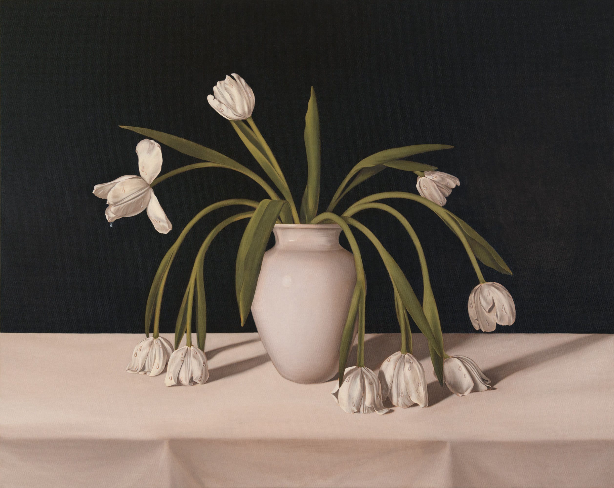
I want to talk about the colors you use in your paintings, because it’s a very specific, consistent palette. Lots of dusty pink, beige, and black. Why those colors?
It’s almost as simple as those are just the colors that I have in my life. I don't wear a ton of color, and if I do, it's red or brown or a dusty pink. It also helps keep things simple in terms of actually painting. It helps everything feel unified.
A lot of the work that I personally love has that same tone to it, and that might be because it's old and aged. But I just like to keep things very simple in some ways, and then very decisive on the details. For me, color is not the important part. I prefer a painting that's 80% neutrals, and then maybe has a pop somewhere.
Who are those artists from way back that you’re thinking about?
I look at a lot of Dutch Golden Age work, like Clara Peeters and Adriaen Coorte. More current, I love Michaël Borremans. A teacher introduced me to Michaël Borremans during my senior year, and it really just turned my entire perspective on art on its head. It coincided with a time when we were assigned to do a master copy, and I picked one of his. Going through that process was so informative. I think he works a similar way — everything is neutral, unless there’s a red, and if there’s a color, it’s for a reason. Everything in my paintings is there for a very specific reason.
How did Borremans turn art on its head for you?
His work is both quiet and cinematic, and I think that there's a darkness to it that I've always really appreciated. It's dark in a subtle way. The whole time I was in illustration, my teachers were very adamant about how obvious the message had to be in our work. It drove me nuts. I remember having an argument with one of my teachers about it. I was just like, “I don't feel that for a piece of art to be effective, it has to smack the viewer across the face with the message.” I think that things can be more subtle. Borremans’s work was subtle in the way I was looking for.
I couldn’t agree more. People are smart, they’ll figure it out. So if it’s not color, what is it in your paintings that’s the thing?
I’m very specific about what I include. If there's a dress, I've picked the dress. If there's a plate, I’ve sourced the plate. If someone’s hair is a certain way, I put that hair there. I spend a lot of time on the reference imagery. It really sets me up to have an easier job at the actual painting.
Walk me through your process when it comes to reference imagery.
Ever since I was a kid, I've always been an obsessive reference-gatherer. I was always clipping magazines, and then Pinterest came along, so I was just saving stuff there. I’ll read or watch something, or see a photo, and an idea will pop into my head. Sometimes the title of a painting will pop into my head first, and I’ll work around that. I’ll sit with it for a while, explore different avenues and ideas, and just kind of shore up the concept in my head.
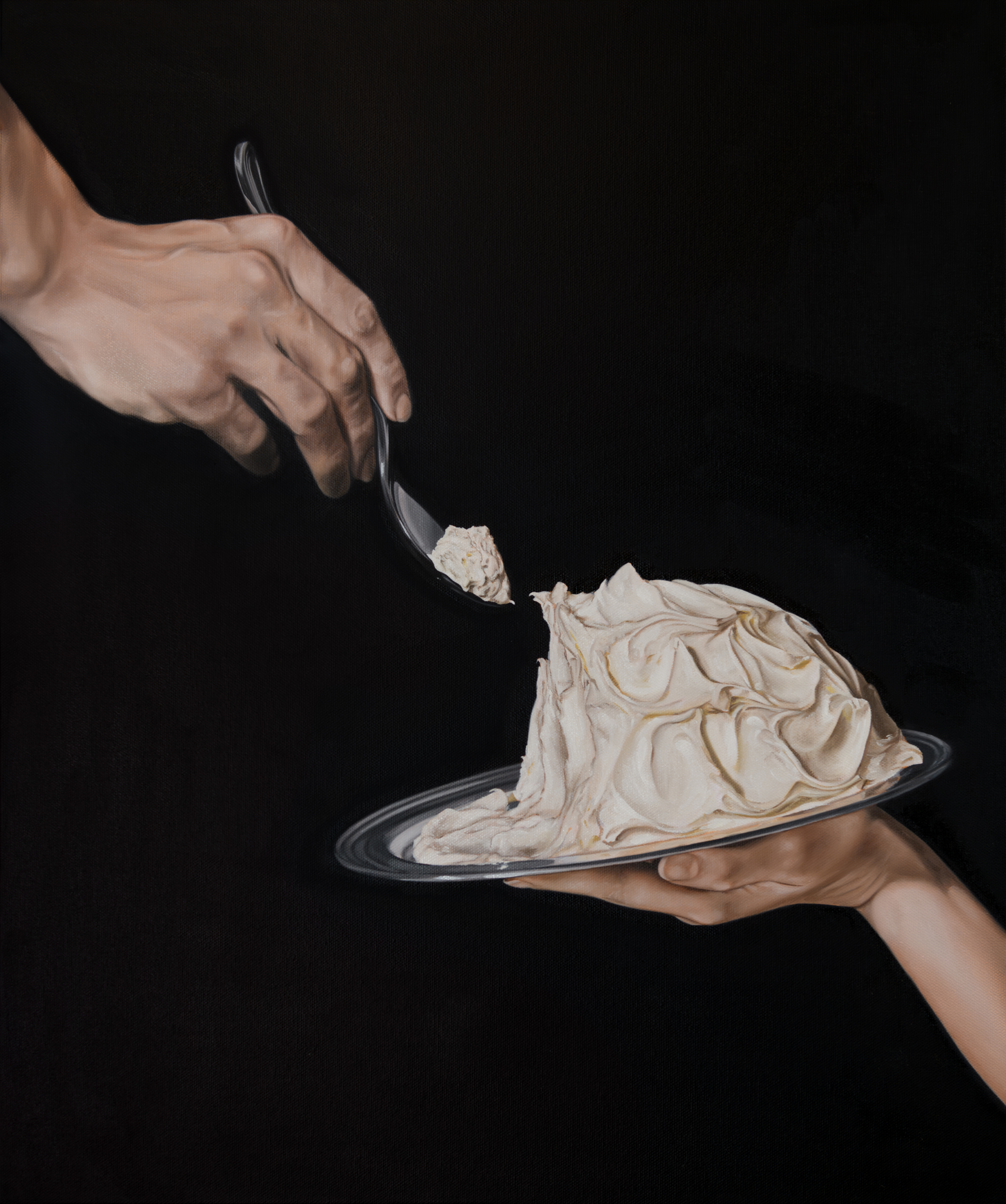
For the cake, I saw a photo of a tray of whipped butter. I just thought this silver plate of something that looks sweet, that was half dug into, was such an interesting idea. I was thinking a lot about heteronormative relationships at the time, and the kind of give and take that's involved. You know, how women are so often asked, and are required, to be happily self-sacrificing. I knew I needed a plate, so I went to Etsy and combed through hundreds and hundreds. I always have in mind what I need the final image to be, what angle it’s going to be at, how much detail I want involved.
I'm always looking for a kind of timelessness. When you're an artist or a creative, you have to define a world and define the language that you're using. There’s kind of a running list of dos and don'ts that I have. I would never put an iPhone in one of my paintings. I mean, never say never, but—
Is this a literal list?
It’s all mental.
Maybe something for your archives, for when they publish the book on your work.
I’ll make it a painting. I’ll do a whole massive wall.
So what happens is that I order all the props, if needed. Sometimes I already have stuff. Then I’ll build out the piece. For the cake, I had a ball of tinfoil and multiple jars of cake icing. My husband, who is a photographer, helped me take the reference photo. It’s his hand and my hand. I wanted it to reference the hand of God and Adam.
There are a lot of historical and personal layers of references. I love still life because for so long, throughout history, women weren't allowed to study anatomy in traditional schools. So they were almost relegated — unless they had a dad who was an artist and was teaching them — to still life work. That was what was deemed acceptable. It’s nice to carry that torch a little bit and bring in modern ideas of feminism, and relate that back to these enduring themes of what it means to be a woman.
Your paintings are very, as they’d say on TikTok, “girl coded.” What aspects of womanhood or girlhood are you chasing?
I think a lot about what it means to be a woman. I can only talk about this from my personal experience, but I’m 32, I just got married, we had this pandemic. My last years of my 20s were stripped from me. Without realizing it, my girlhood is slipping away. What does that mean? And how can I reflect on girlhood, now, looking back at it?
I think my work, as the kids would say, has always been for the girlies. I’ve been thinking a lot about what the female gaze is and what that means. I saw somebody talking about how girl dinner has done so much for feminism in the last few months. I think there’s something beautiful about being honest about the things we like and the things we do in private.
There’s also something so nice about going to a museum, looking at a painting, and knowing that even if that painting was done in the 17th century, it was a person sitting at an easel using materials that weren’t that different from what you’re using. There’s this connection. And I think womanhood and girlhood work that way, too. Everybody has a different experience, obviously, but there are enduring themes.
There’s this painting that I think about a lot. It’s a still life by Clara Peeters. As I mentioned, women were relegated to still life at that time. She snuck in a vase that has these bubbles to it, and in each bubble, she did a teeny-tiny self-portrait as a reflection. In my mind, it’s the best fuck you.
Is there a part of the painting process that you most enjoy?
I try to approach a lot of my work in a very traditional way. There’s a sketch phase, then transferring the sketch to the canvas. I always do an underpainting. I do lights and darks, then there’s a color layer, then glazing.
I love the underpainting part. I get so nervous every time I start a painting. I psych myself out, and I get really anxious about it. I feel all the imposter syndrome stuff. Underpainting is nice because there’s no pressure. You’re just getting the feel of everything. All you have to worry about are the lights and darks, and it’s going to get covered up anyway, so it’s fine. I’m such a perfectionist.
I got that sense!
Yeah. I've always been such a thoughtful, anxious person. Even as a kid, I always put my marker caps back on, and everything was color organized.
I had a different teacher — art school really puts you through the wringer — who felt like I needed to loosen up a little bit. That really ate away at me for a long time. I felt like my natural instincts weren’t correct. Taking all this time off and coming back to oil painting, I was trying to see what I like in other paintings and what I like in my own work. Realizing that maybe my strengths lie in how thoughtful, specific, and detail-oriented I am. Some people thrive on painting really loosely. I’m just not one of them.
You can follow Meghann Stephenson’s work on Instagram.
A fun parting factoid is that I got a shoutout in an academic paper titled “The Field of Spookiness: An Historical Survey,” which was recently published in Supernatural Studies. (A REAL JOURNAL!) I’d interviewed its author, Stephen Olbrys Gencarella, for an essay I wrote about spookiness last year, and our conversation prompted him to take a closer look at the historical evolution of spookiness. This is as close as I will ever come to receiving a graduate degree.
Happy haunting,
Eliza